← Back to the website review

ClearPath Property Care demonstration

Sample Website Review

ClearPath is a fictional website created for this demonstration, not a client project or case study.

1 complete review note 5 concise supporting notes Organization, Focus, and Finish

Section 03 · Supporting review notes

Five supporting review notes

02 Organization Must revise

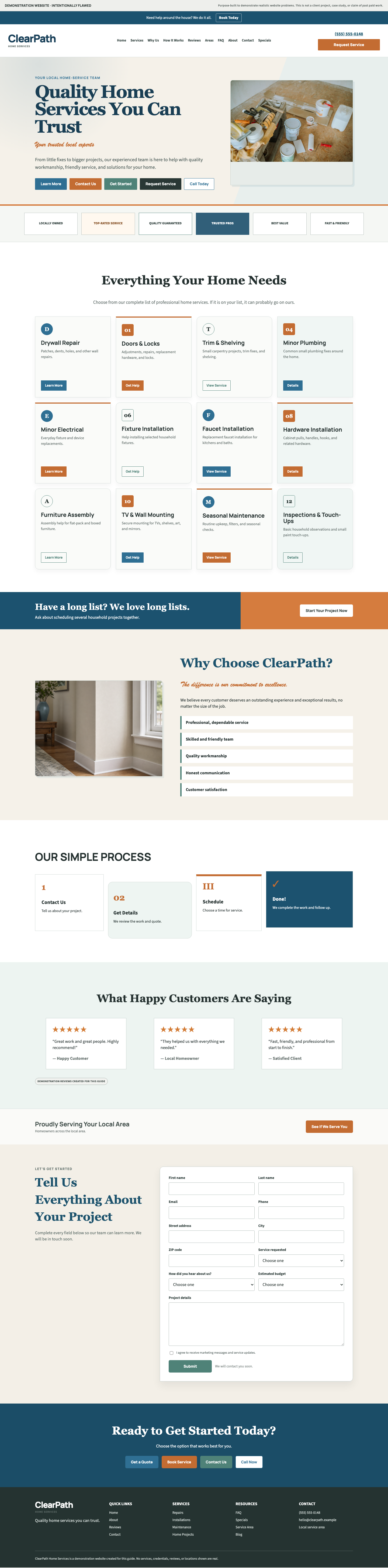
Service overload

Observation

Twelve equal service cards and repeated buttons create a long, unprioritized list with no clear starting point.

Recommended action

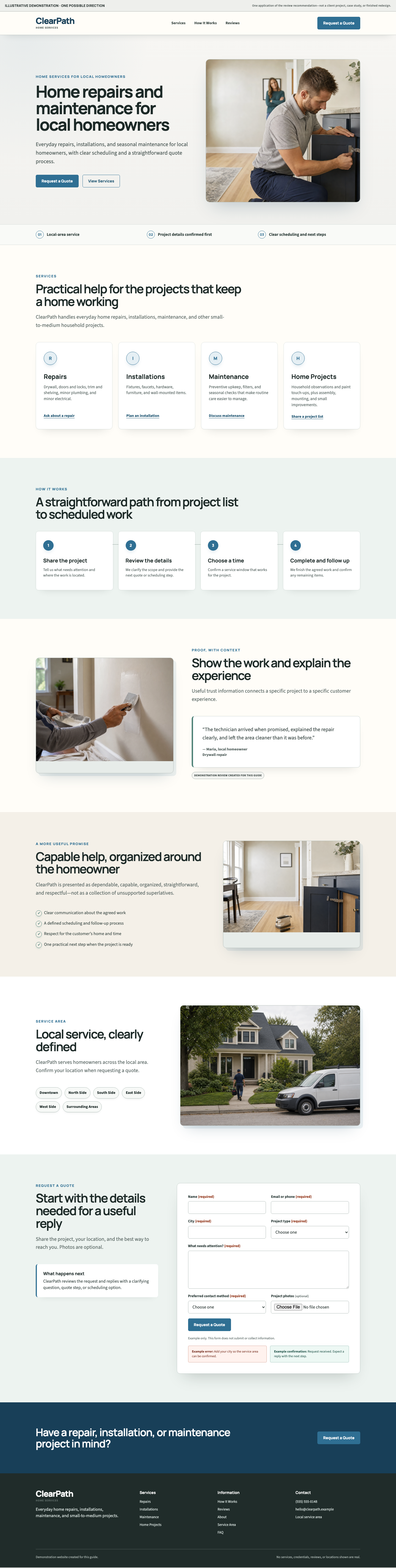
Group services into a few categories and use one section-level next step.

03 Focus Must revise

Competing actions

Observation

Five equally prominent hero buttons leave no clear next step and slow the decision.

Recommended action

Use one primary action and one quieter secondary option; move the rest lower on the page.

04 Finish Must revise

Long quote form

Observation

The eleven-field quote form asks for unnecessary information, then ends with a vague confirmation, creating extra work that discourages completion and uncertainty about what happens next.

Recommended action

Ask only for essentials, mark optional fields, and explain the reply and scheduling process.

Two more review notes
05 Focus Useful improvement

Trust clutter

Observation

Generic reviews, unsupported badges, and context-free proof act as trust signals visitors cannot connect to a real service or outcome.

Recommended action

Use specific project evidence and reviews that name the work and result.

06 Finish Useful improvement

Inconsistent visual system

Observation

Mixed rules for buttons, icons, colors, type, and cards make the page feel assembled and controls harder to read.

Recommended action

Reuse one system for hierarchy, type, spacing, and cards.

Want this kind of clarity for your website?

Request your review